If you’re an app developer, you should learn from the greats. YouTube’s app is one of the most popular, and its constant updates keep people engaged. Also, knowing how YouTube’s app works can help you if you’re a YouTuber. You can buy YouTube followers and look for ways to engage users via the app.

With that said, YouTube’s app has been around since 2007. Making an article about every update would take all day, so let’s look at some significant updates from 2017 to the present and explain how they’ve helped engagement on the platform. We’ll also go over how these can help you understand YouTube even better!
2017: Changes Their Logo
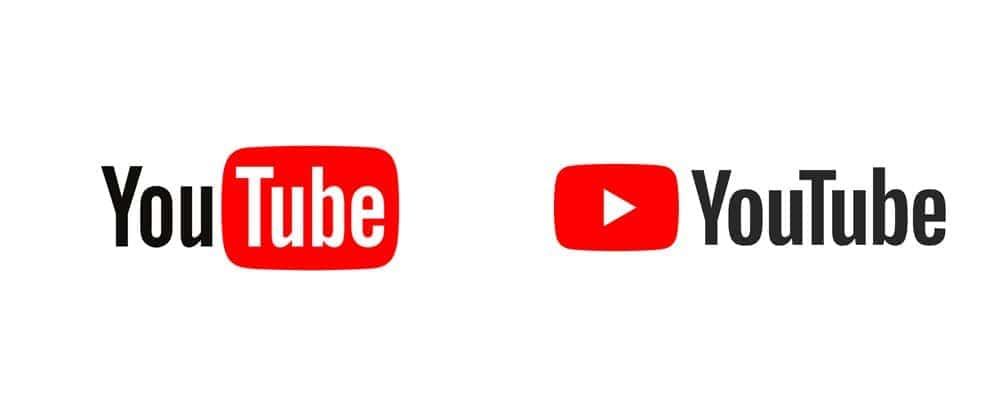
In 2017, YouTube changed its logo—the logo used to have their TV in the Tube part of their name. Now, the name is spelled in full, and there is a TV icon with a play button on the side.

Some may prefer their old logo better, and we understand that. However, simple logos for mobile apps are a vital part of design. The TV with the play button is now an abbreviated icon, not taking too much space on the app.
Besides that, YouTube added other options for their videos, such as the ability to speed up or slow them down. As an app developer, you want to create many opportunities for people to enjoy the content they watch.
2018: The App Adds a Dark Mode
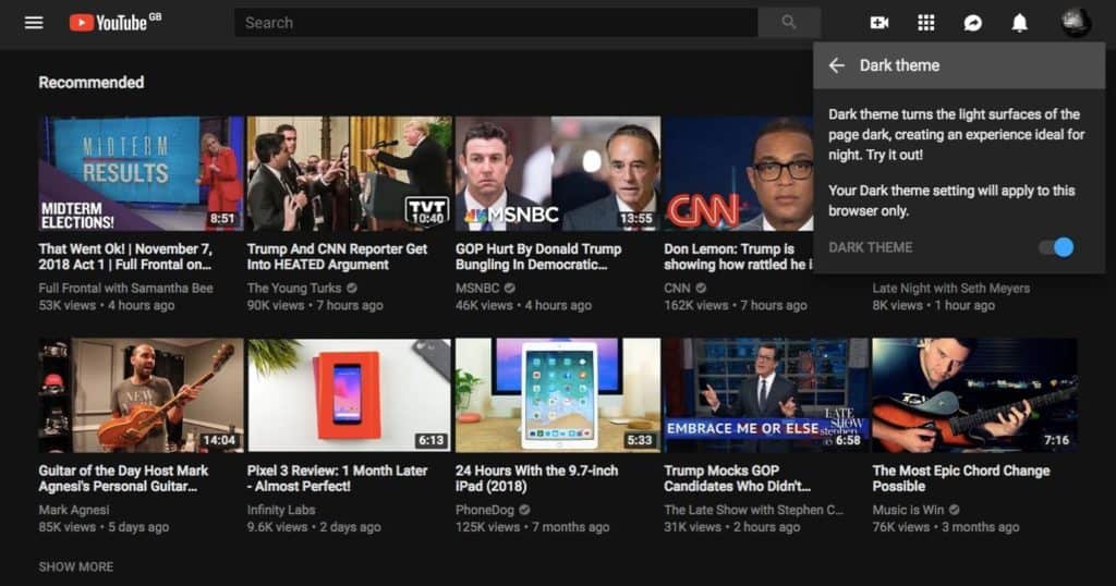
One of the significant updates in 2018 was the app rolling out a dark mode. A dark mode is when you change the white background to black and the black text to white.

In the 2010s, dark modes on websites and apps quickly rose in popularity. There are many reasons for this. Some people like dark mode because it’s easier on the eyes. Others say it saves battery on their mobile devices. At night, dark mode can help someone fall asleep faster because it’s less bright.
Knowing this, YouTube added it, and it helped those who may have eye strain issues enjoy the platform more. If you’re an app developer, consider adding a dark mode.
2019: YouTube Makes it Easier for Landscape Users
Landscape mode is vital on YouTube, as this is how you view videos in full screen. However, before 2019, people would have to switch back to portrait mode if they wanted to like, dislike, or share the video.
Switching from landscape to portrait is not a huge deal. However, it can get gradually annoying if you’re trying to watch multiple videos. YouTube realized this as well, and in 2019, it added the ability to like, dislike, and share while still in fullscreen mode.
As an app developer, it’s essential to look for even the mildest pain points on your app and find ways to fix them.
2020: Added the Ability to View Different Chapters
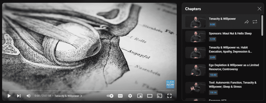
It was 2020, and many people were staying home more because of a particular pandemic. YouTube took the time to improve its user experience by letting creators add chapters to their videos and letting app users navigate them while watching videos on the app.

One reason chapters are essential is that some videos, mainly documentaries and essays, can be long. Some can be an hour, two hours, or even as long as your eight-hour shift! You may want chapters to navigate through the video. These can help you get to the essential parts and work if YouTube doesn’t save your place in the video. As an app developer, looking for ways for people to get what they need is vital.
2021: Adds HDR to PS5
2021 wasn’t a significant year for updates, but PS5 users rejoiced as the YouTube app on PS5 allowed users to watch HDR content there. The high-dynamic range makes content more photorealistic, and with more people having access to HDR TVs (and the PS5’s capabilities,) this update made sense. As an app developer, you must always add support for the latest technologies. Apps are not just for phones but for tablets, consoles, and much more. Each app should have equal permission.
2022: Pinch to Zoom
By 2022, most phones had crystal-clear image quality. But because of the screen size, there were times when a person may want to zoom in to see a detail. One 2022 update added a pinch-to-zoom feature. This feature made it so you could zoom in by using a pinching motion on your screen. Through this convenient move, people could see extra details like never before. As an app developer, you want to optimize your app for mobile users in every way, including zooming in.
2023: Community Notes Feed
As of this article, YouTube is testing a community notes feed. The community tab is already available in each channel’s tabs. Community posts can include video updates, polls, and other posts that shoot the breeze with their fans.
The feed will make it so you can see community posts from all content creators you subscribe to. Before then, these posts may sporadically appear in the home or subscription tab.
As an app developer, you want to ensure people get all the updates they need in one easy-to-access package. This is what the community notes feed strives to do.
Final Thoughts
As you can see, YouTube has added many changes since 2017 and will continue to do so. These updates only scratch the surface; there are many more in those years, and not to mention that there are ten other years the app was live. You look at early screenshots of the app, and you’re on an entirely different planet.
We are not saying that all of these updates were necessarily popular, either. For example, people preferred the old logo, and whenever the feed’s design is changed, someone complains. However, the goal is to provide a more navigatable experience for all users and to streamline every aspect of it. As an app developer, you should work to do the same.