When you create a profile on Twitter, it is quite important to focus on the Twitter header’s design. With over 300 million tweets every day, it is important to consider how you can distinguish your profile from others. Making the perfect header can be quite confusing for beginners and experts alike.
There are many factors that need to be kept in mind when creating the perfect Twitter header for your Twitter profile. In this article, we will discuss some of the most common twitter header ideas to build the perfect backdrop for your Twitter background. You can even learn How to Change Twitter Background.
We have also included 23 Best Twitter banner examples to take inspiration from in case you’re out of ideas.
Best & Unique Twitter Headers Pictures Examples
Now, before you get started with creating a Twitter header for your brand, take a look at these big corporations that have crafted interesting and unique Twitter headers on this platform.
1. Lyft
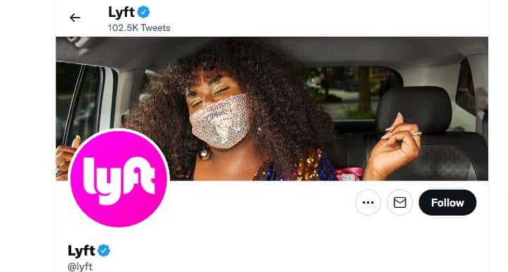
This is a great example of a minimalistic, but impactful header that goes well with the brand. Lyft focuses on simplicity and quirkiness to appeal to customers.
2. Canva
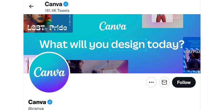
Canva is a well-known service that allows you to design different websites and other digital content. Their Twitter banner is a great example of how you can display what your company does.
3. Target
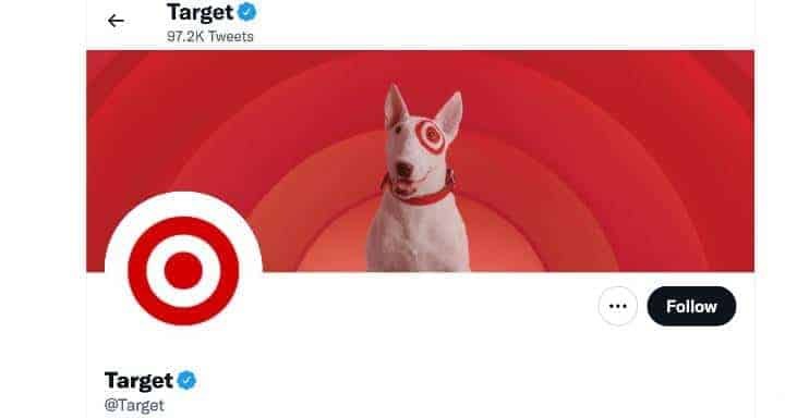
Target’s Twitter banner is another great way to attract customers to their profile. The unique design used by them provides a visually appealing outlook to customers.
4. LinkedIn SlideShare
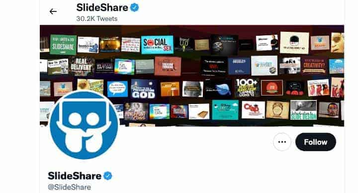
This platform has designed its Twitter banner in such a way that all of its popular services can be looked over by new users.
5. British Airways
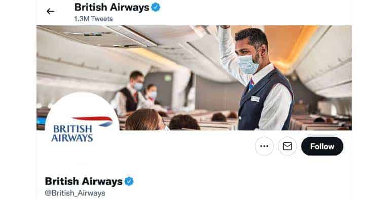
British Airways opts for a more classic approach to its Twitter banner. They show one of their flights, along with various employees to make new customers familiar with them.
6. Taco Bell
Taco Bell uses its Twitter banner to show the things that they serve – Tacos. The Twitter banner design is also quite minimalistic in this case.
7. Netflix
Netflix has found a great use for its Twitter banner space – Keeping users updated with the latest trending shows on their platform.
Netflix Middle East & North Africa
Shows that are trending in the Middle East and North Africa regions are shown on the Twitter banner of this account.
Netflix Japan
This Twitter profile also uses the same strategy to keep its users updated with the latest shows in Japan.
Netflix Korea
The North Korean branch of Netflix on Twitter also displays the latest trending shows on their banner space.
8. Animoto
Animoto follows the strategy of using simple textures paired with the various services that the company offers. With a simple text font and minimal design, this banner looks quite aesthetic.
9. Basecamp
Basecamp uses humor and simple cartoon graphics to make the best use of its Twitter banner space. They also offer a reason to users as to why their service is great directly in the banner.
10. Rio Tinto
Rio Tinto stands for ethical mining of natural resources, and they show this in their Twitter banner in the form of a barren tree. This catches the eye of most followers and new visitors.
11. Etsy
Etsy divides its Twitter banner into simple elements that look quite good when paired together with each other.
12. Starbucks
Starbucks emphasizes their coffee variations in their Twitter banner to attract users. This is a great strategy that is used by many other companies.
13. TOMS
TOMS chooses to show their customers on their Twitter banner. This helps new visitors to feel more familiar with the brand.
14. Danone
Danone shows a simple family consuming their products in their Twitter banner. The emphasis on this product as a daily supplement is shown here.
15. UNICEF
UNICEF uses experimental colors and images of human crisis to strike an emotional response in their followers and new visitors.
16. Old Spice
Old Spice has designed its Twitter banner to appeal to the customers that they are targeting. They use a charismatic and unique header for this purpose.
17. Petzl
Petzl shows a dimly lit environment in the evening to showcase their product’s purpose. This company shows their lamps lighting up the scenery to emphasize their efficiency.
18. Garmin
Garmin uses a more direct approach to promotion on their Twitter banner. They show a landscape photo and a few of their best wristwatches on their banner.
19. Live Nation
Live Nation shows the user a picture of their services and provides a glimpse of the artists that they feature.
20. Chloé
Chloé is another brand that chooses to show the figures behind the products that they offer. The models that are dressed in their products are displayed on their Twitter banner.
21. Vodafone Group
This company uses a simple piece of text with a clever technique to catch the eye of customers. With a simple and consistent color scheme, the message is also quite easy to read.
22. Maersk
Maersk uses the natural beauty of the locations where they offer their services. The landscape images are designed to let the user know the harsh terrains that Maersk serves.
23. American College of Sports Medicine
This college tries to show its essence through simple daily objects that are related to the academic courses that they offer. They use consistent color, minimalistic images, and a textured background.
Conclusion
The Twitter banner is most often the first place that people see when they open a profile on the platform. Knowing and leveraging how to make the most out of this space is a great way to advertise your services or keep your customers interested. We hope this article helps you to create the perfect banner for your brand.